Community resources
Community resources
Column Charts in Jira
When managing workflows in Jira, visualizing data is key to uncovering actionable insights. One of the most effective ways to do this is through Column Charts. These charts are not just visually appealing—they provide clarity, foster better decision-making, and help teams stay on track.
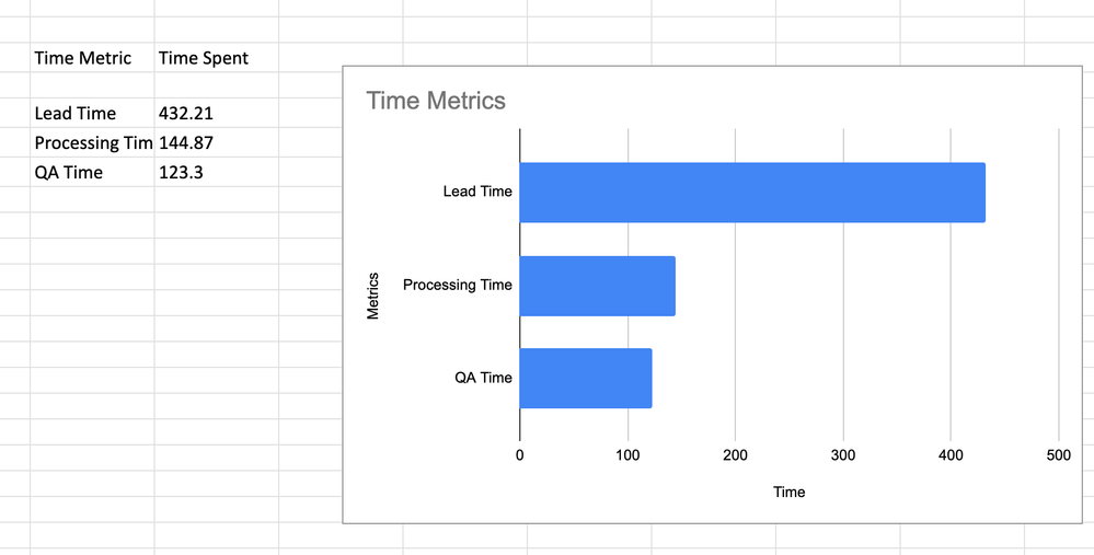
In this article, we will explore what a Column Charts are, examine and analyze examples of Bar Charts and discuss how it can be created using the Time Metrics Tracker.
What is a Column Chart?
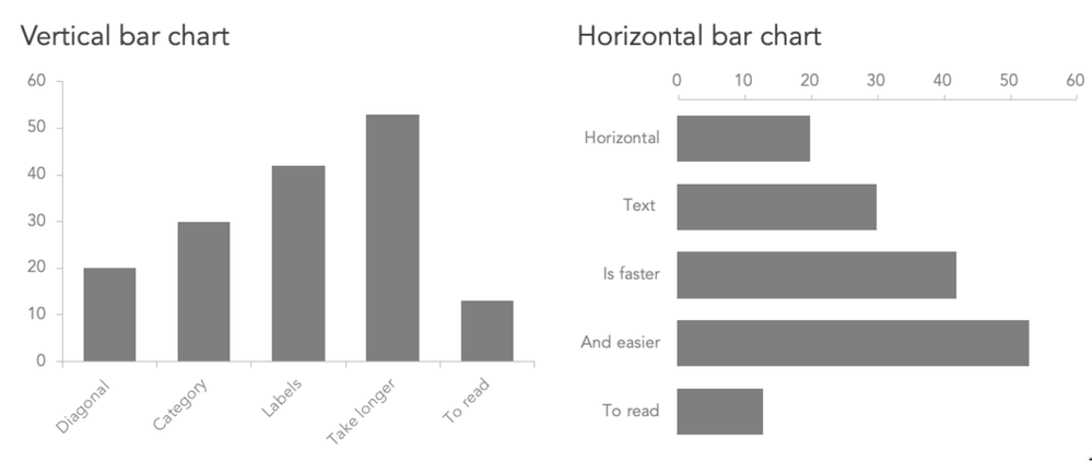
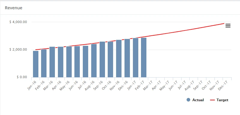
Column Chart is a graphical representation where data is displayed as vertical bars along an X and Y axis. The height of each bar corresponds to the value of the data point, making it easy to:
- Compare quantities or metrics across categories.
- Identify patterns, trends, and outliers at a glance.
- Monitor progress over time with clarity.
Column Charts are widely recognized by their primary name, but they may also be referred to by several alternative names depending on the context, software, or region. Here are some common alternative namings for Column Charts:
- Bar Graph (Vertical)
- Emphasizes the vertical orientation of the bars compared to a standard bar graph (which may often be horizontal).
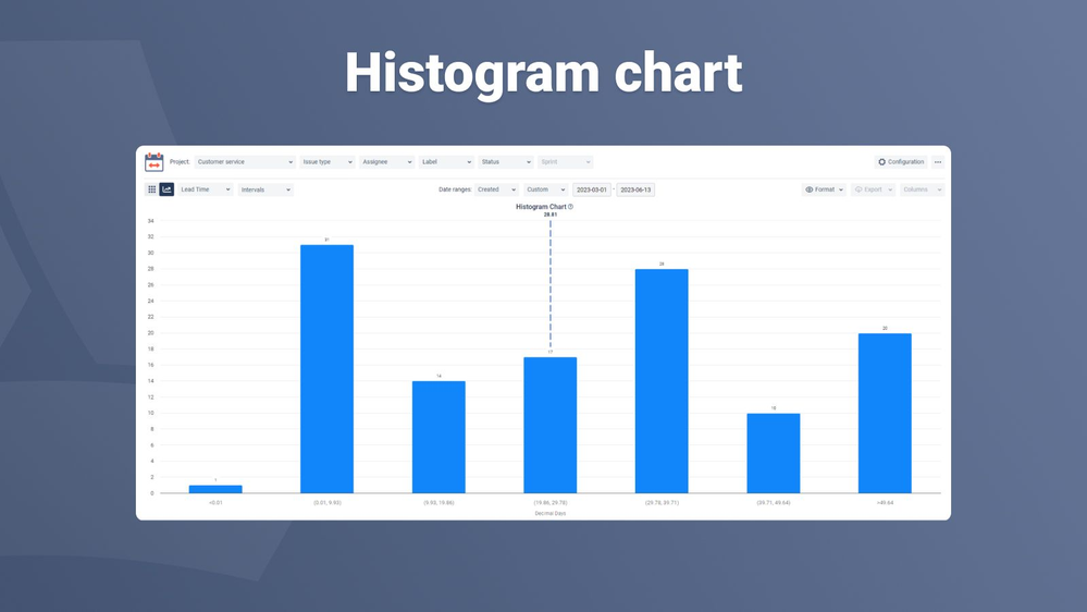
- Histogram (in some cases)
- While histograms are technically a distinct type of chart used for frequency distribution, some people use the term interchangeably when the data categories are numeric and sequential.
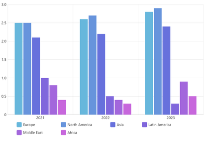
- Clustered Column Chart (specific to grouped data)
- Refers to column charts that display data in clusters for comparative purposes.
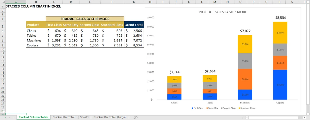
- Stacked Column Chart (specific to stacked data)
- Indicates that the data is stacked within each column to show parts of a whole.
- Performance Chart
- Sometimes used in business contexts when the chart visualizes metrics or performance-related data.
Why Use Column Charts? 🤔
Column charts are a go-to tool for teams and organizations because they simplify the process of interpreting key performance indicators (KPIs). Here’s why they’re essential:
- Compare performance metrics 📊:
Visualize how different tasks or statuses measure up against each other. For example, track which sprint took longer to complete or compare time spent in development versus QA. - Spot workflow bottlenecks ⛔:
Use column charts to pinpoint stages in the workflow where tasks tend to pile up, allowing teams to prioritize improvements. - Understand trends over time ⏳:
Analyze how metrics like Cycle Time or Lead Time evolve across multiple sprints or projects. - Enhance team communication 🗣️:
Column charts provide a visual foundation for team discussions, making it easier to convey complex data during meetings or reviews.
Who Benefits the Most from Column Charts? 👥
Column charts cater to various roles within Agile and project management environments. Here’s how different audiences can benefit:
1. Scrum Masters 🧑🏫
- Track Team Efficiency: Monitor metrics like Lead Time and Cycle Time to gauge team productivity.
- Plan Sprints Better: Understand historical performance to estimate task durations more accurately.
- Resolve Bottlenecks: Identify stages in the workflow that cause delays and work with the team to address them.
2. Project Managers 📋
- Measure Milestone Progress: Use column charts to ensure tasks are on track to meet deadlines.
- Analyze Team Comparisons: Compare metrics across different teams or projects to allocate resources effectively.
3. Product Owners 🛠️
- Assess Feature Delivery Timelines: Determine whether features are being delivered within expected timeframes.
- Understand Dependencies: Spot areas where dependencies between tasks slow progress.
4. Business Analysts 📊
- Visualize Trends: Use historical data to identify inefficiencies and suggest process improvements.
- Enhance Reporting: Deliver polished, data-driven presentations to stakeholders using visually compelling column charts.
What Makes Column Charts Essential for Agile Teams? 🚀
Column charts excel at addressing the challenges Agile teams face by offering a clear, data-driven perspective. Here’s why they’re indispensable:
- Clarity: They make complex data easy to digest by presenting it visually.
- Insightful Trends: Highlight trends that might be missed in raw datasets.
- Quick Comparisons: Ideal for assessing time spent across multiple statuses or tasks.
- Actionable Insights: Help identify areas for immediate improvement, such as statuses with unusually high wait times.
- Versatility: Adaptable to various metrics and use cases, from tracking individual tasks to evaluating entire workflows.
How Time Metrics Tracker Supercharges Column Charts 🔧
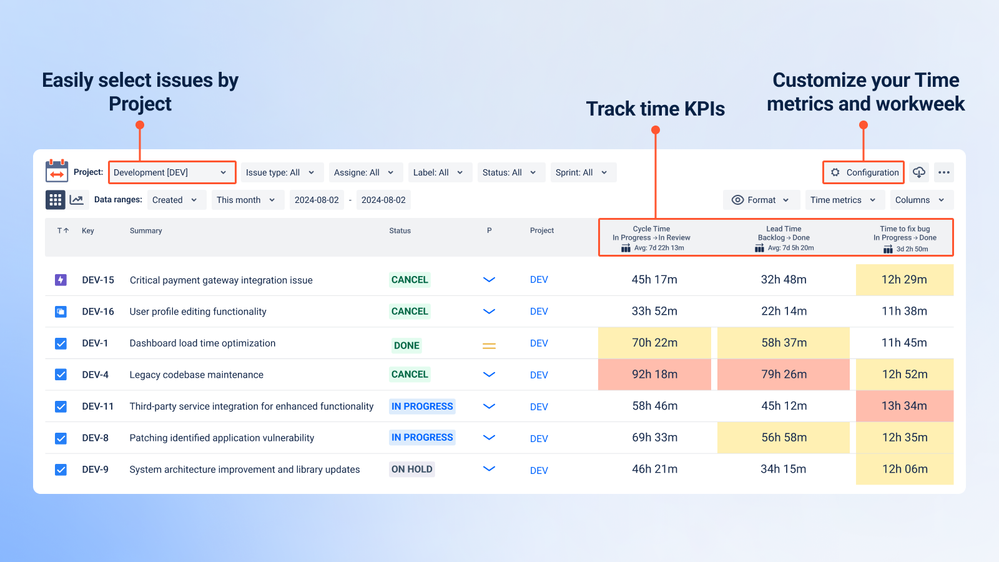
Time Metrics Tracker add-on is the ultimate tool for tracking, analyzing, and optimizing your workflow metrics in Jira. Here’s how it enhances your experience with column charts:
Comprehensive Metrics
Gain access to essential KPIs such as:
- Cycle Time: Measure the total time it takes for an issue to move from start to finish.
- Lead Time: Track the time it takes to complete an issue from the moment it’s created.
- Resolution Time: Understand how long it takes to resolve issues.
- Wait Time: Identify delays in statuses where no active work occurs.
Export Capabilities
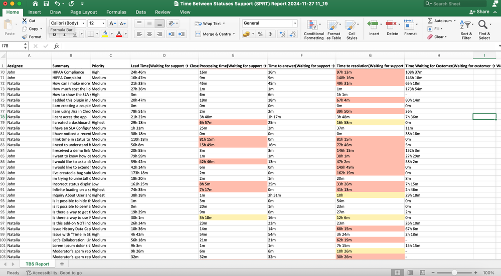
Time Metrics Tracker allows you to export all key metrics into Excel 📁. This feature is invaluable for users who want to create detailed column charts for presentations, reports, or in-depth analysis.
Custom Visualizations
While Time Metrics Tracker provides extensive metrics and insights within Jira, exporting the data to Excel enables you to build fully customizable column charts tailored to your specific needs.
Workflow Optimization
By visualizing your metrics with column charts, you can uncover inefficiencies, set benchmarks, and ensure your team operates at peak efficiency.
How to Create Column Charts with Time Metrics Tracker
Although the feature is not built into the add-on, creating a bar charts is simple with these steps:
1. Export Time Metrics:
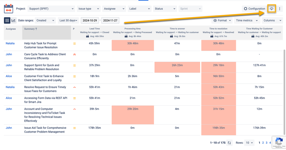
- Open your Time Metrics | Time Between Statuses add-on.
- Click the export button and select XLS or CSV.
2. Get Time Data in Excel:
- Download Time Data Metrics into Excel and review the columns (e.g., statuses, time spent, and percentages).
- Aggregate or clean data if necessary (e.g., grouping smaller statuses into "Other")
3. Create a Column Chart in Exel:
- Calculate the relevant columns (e.g., Status and Percentage).
- Navigate to the Insert tab, then select Column Chart.
- Customize your chart by adding titles, labels, and adjusting colors.
Conclusion
Column Charts are more than just a way to display data — they are a powerful tool for comparing metrics, uncovering trends, and driving better decisions in your workflows. By offering a clear, visual representation of key metrics, Column Charts make it easy for teams to identify inefficiencies, monitor performance, and improve collaboration.
With tools like the Time Metrics Tracker and Excel at your disposal, you have everything you need to turn raw data into compelling visuals that guide better workflow management.
Turn your data into actionable insights and take your workflow management to the next level with data visualisation! 📊✨
Was this helpful?
Thanks!
Vitalii_Bobak_SaaSJet
About this author
Manager of Customer Success – SaaSJet
5 accepted answers


0 comments