You may be experiencing slow load times on the forum; the team is working to resolve this ASAP.
×Community resources
Community resources
Navitabs Just Got Better 💡 See What's New!
Introducing a significant update to Navitabs – Navigation Macros for Confluence, by Communardo Products, designed to elevate the user experience for Confluence content creators, administrators, and collaborators. This release features a modernized user interface, improved customization options for tab design, a new app name, and a new way to present and navigate content: Cards.
Navitabs has been rebranded as Navitabs—Navigation Macros for Confluence to better reflect this expanded functionality and highlight the broader range of available navigation options.
Whether you manage complex documentation, organize internal resources, or build structured content for external users, these new features are crafted to give you greater control, flexibility, and visual impact.
Tabs: More Design Options and Improved Customization
While tabs remain a key element of Navitabs Navigation Macros for Confluence, we’ve improved them with new designs and additional flexibility.
Users can now access three predefined tab styles—each offering a modern look and more customization.
- Confluence Tabs, which preserve the native Confluence look and feel, ideal for teams seeking visual consistency with the platform.
- Square Tabs, a refined update to the former “Navitabs Default” style. These tabs offer a sharper, cleaner layout suited for structured content.
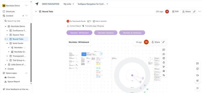
- Round Tabs, a new addition that brings a modern, softer aesthetic with rounded edges, offering a fresh take on visual organization.
In addition to selecting from these predefined styles, administrators now have significantly greater control over the appearance of tabs. Within the Tab Design administration panel, it is now possible to not only create custom tab designs but also to edit or delete them as needed. Even the predefined styles can be modified, allowing for deeper alignment with organizational branding or specific space requirements.
For instance, a company maintaining multiple Confluence spaces for different departments might use “Square Tabs” in internal documentation, “Round Tabs” for externally-facing guides, and a custom design with specific brand colors for onboarding and training materials. This level of design flexibility ensures that content presentation can be tailored to both the audience and the purpose.
A Modern User Interface for a Better Experience
One of the most visible changes in this release is the complete refresh of the Navitabs user interface. The updated look embodies modern design principles, providing a cleaner and more intuitive experience for both content creators and end-users. Elements have been optimized to minimize visual clutter. Spacing has been adjusted for better readability, and interactive components respond more smoothly. The settings panel has been tidied up for better usability, but it contains all the familiar options you are used to if you have already used the macro.
This redesign is more than aesthetic. A modern UI significantly improves usability. It helps users focus on content, reduces friction when navigating between sections, and contributes to a more professional appearance for your Confluence spaces. For teams maintaining large-scale documentation or knowledge bases, this change makes day-to-day use more efficient and enjoyable.
Introducing a New Navigation Type: Cards
Perhaps the most exciting addition in this release is the introduction of a new navigation format: Cards. Up until now, Navitabs has focused exclusively on tabs as the primary navigation element. With this release, we are expanding that model to include other navigation types—starting with Cards, for now, only available on the Tab Wizard macro.
Cards represent a reimagining of how navigation can work within Confluence. Instead of relying solely on horizontal or vertical tab bars, Cards allow users to present navigation items as interactive blocks that can include text and images. This opens the door to new use cases and more visually engaging content layouts.
Currently, Cards are best suited for landscape orientation. This ensures they remain readable, balanced, and visually appealing across different screen sizes.
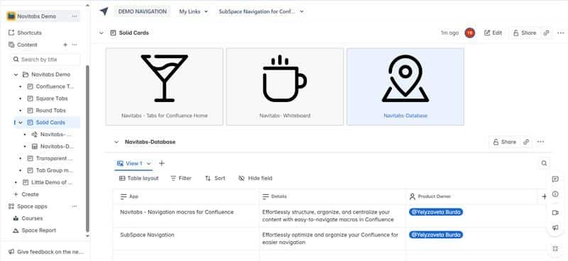
There are two available card styles:
Solid Cards have a filled background color that helps them stand out clearly on the page, making them suitable for structured, attention-grabbing sections, like key products or services.
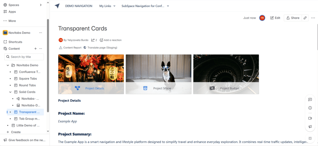
Transparent Cards blend more easily with the page background, giving a lighter and more minimal look. They are ideal for more subtle navigation or when used within already colorful or media-heavy spaces.
The addition of Cards enables users to move beyond traditional tab navigation and explore more expressive, flexible ways of organizing content. And this is only the beginning—additional navigation types are already in development and will be released in future updates.
Real-Life Example: Building a Product Knowledge Hub
To illustrate how these new features come together in practice, let’s look at a real-world use case.
A mid-sized software company maintains a Confluence-based Product Knowledge Hub that serves as a central resource for internal staff, partners, and occasionally customers. The existing hub had grown challenging to navigate, with long scrolling pages and dense content. With this Navitabs update, the documentation team undertook a complete redesign.

They began by using the new Cards navigation type on the landing page. Each card represented one of the products, displaying the product name, logo, and a brief description. Clicking a card led users to a well-structured documentation space. Inside each product space, Squared Tabs were used to present sections like Overview, Features, Release Notes, and FAQs in a structured and welcoming way. For internal technical documentation, they used Round Tabs to create a clean user-friendly experience. Confluence Tabs remained used in shared HR onboarding spaces to maintain stylistic consistency.
The team also used the updated design management tools to standardize tab styles across departments. They defined custom themes using their branding and removed old, inconsistent tab designs that had accumulated over time.
As a result, the Product Knowledge Hub became more intuitive, visually engaging, and easier to manage. Internal feedback was overwhelmingly positive, with users praising the improved clarity and aesthetics. Page engagement increased significantly, and onboarding time for new employees decreased due to the provision of better-structured information.
Have Questions or Want to See It in Action?
If you’re curious about how Navitabs can help you create a more intuitive navigation experience in Confluence, feel free to drop your questions in the comments below — we’re happy to help!
Want a closer look? Book a demo with our team to see Navitabs in action and explore how it can fit your use case.
Was this helpful?
Thanks!
Elena_Communardo Products
About this author
Product Marketing Manager
Communardo
Austria
6 accepted answers
0 comments