Community resources
Community resources
Pie Charts for Comparing and Analyzing Time in Statuses Data: Visualizing Time Metrics
Pie charts are one of the most popular visualization charts for presenting data in an easy-to-understand, proportion-based format. In this article, we will take a closer look at the best practices for using pie charts to visualize time metrics and understand what makes them such an effective tool for data analysis. We will also use the Time Metrics Tracker add-on as an example of a time tracking solution in Jira, highlighting how its data can be exported to create compelling pie charts.
Why We Love Pie Charts: The Science Behind Their Simplicity
Pie charts are one of the most beloved visualization tools, and for good reason—they tap into the human brain’s innate ability to interpret proportions quickly and effortlessly. Here’s why pie charts are so effective:
1. Intuitive Understanding of Proportions
Humans are naturally adept at comparing parts to a whole. Pie charts visually represent this concept by dividing a circle into slices, making it easy to see which categories dominate and which are minimal.
2. Simplicity in Design
Pie charts strip away unnecessary complexity. By focusing on just one key metric—percentage—they avoid overwhelming the viewer, which can happen with bar graphs or scatter plots.
3. Visual Appeal
Circles are universally familiar and pleasing shapes. Pie charts are visually engaging and inherently less intimidating than grids or dense tables, making them ideal for presentations and reports.
4. Quick Insights at a Glance
- Larger slices immediately draw attention, helping users identify critical data points without digging deep.
- Smaller slices signal areas for improvement or less significant metrics.
5. Color and Shape Recognition
The use of distinct colors for each slice enhances memorability. Our brains are wired to recognize and remember colors and shapes, making pie charts not just easy to read but also easy to recall.
Why Use Pie Charts for Time Metrics?
Pie charts are particularly effective for:
- Displaying proportions: They show how different categories contribute to the whole.
- Comparing limited data points: Ideal when there are a few distinct categories (3–7 segments work best).
- Identifying imbalances: Quickly highlight the largest or smallest contributors.
Best Practices for Visualizing Metrics with Pie Charts
To make your pie charts impactful, follow these best practices:
- Keep it simple:
- Limit the number of segments to avoid clutter.
- Avoid pie charts for datasets with too many small or insignificant categories.
- Focus on proportions:
- Use them for comparing time spent in statuses like "In Progress," "Blocked," or "Done" as a percentage of the total.
- Use contrasting colors:
- Make each slice visually distinct to enhance readability.
- Label wisely:
- Add clear, concise labels with percentages or category names.
- Combine categories if necessary:
- Group smaller statuses into "Other" for a cleaner visualization.
What Can Be Compared Using Pie Charts?
Pie charts are particularly useful for visualizing how time is allocated across different categories, making them ideal for comparing specific time metrics. Here are a few examples of what you can analyze with pie charts in the context of time tracking:
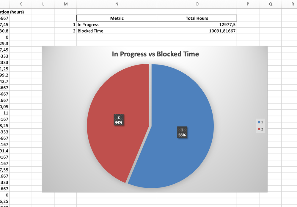
Productive Time vs Blocked Time
One of the most insightful comparisons is the ratio of blocked time (when tasks are stalled due to external factors) to productive time (when tasks are actively being worked on). A pie chart can instantly reveal:
- The percentage of time spent in "On hold", "Waiting for Review", "Waiting for release" versus "In Progress" statuses.
- Whether blocked time is consuming a disproportionate amount of your workflow, highlighting areas to address.
Productive Time Statuses
These represent periods when tasks are actively progressing:
- In Progress: The task is being actively worked on by a team member.
- Code Review: The task is under active review by peers or leads.
- Testing: The task is being tested for quality and functionality.
- Development: Active coding, designing, or building phase.
- Implementation: Deploying or integrating the task into production.
- Analysis/Research: Active effort to gather data or insights for the task.
Blocked Time Statuses
These represent periods when tasks are stalled due to obstacles or waiting periods:
- Blocked: Explicitly marked as blocked by an issue or dependency.
- Waiting for Approval: Tasks awaiting managerial or stakeholder sign-off.
- Waiting for Customer Feedback: Stalled while waiting for input from clients.
- On Hold: Temporarily paused, either due to prioritization or resource constraints.
- Waiting for Dependencies: Tasks dependent on the completion of another task or deliverable.
- Escalated: Tasks delayed because they’ve been escalated for further action.
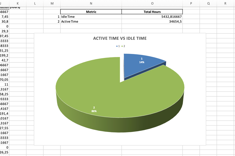
Active Time vs. Idle Time
You can use a pie chart to compare the time spent actively progressing tasks versus idle time when tasks are waiting in queues. This analysis is crucial for identifying bottlenecks, such as tasks sitting too long in "To Do" or "Ready for Review."
Active Time Statuses
These represent periods when the task is actively being worked on or moved forward:
- In Progress: The task is being worked on by a team member.
- Code Review: The task is under peer or manager review.
- Testing: The task is being validated or tested for functionality.
- Implementation: The active development or deployment phase.
- Analysis: The task is being researched or evaluated actively.
- Rework Required: The team is making corrections after a review or test.
Idle Time Statuses
These indicate times when the task is waiting and no active work is being performed:
- To Do: The task is in the backlog or has not yet started.
- Blocked: The task cannot progress due to external dependencies or issues.
- Waiting for Approval: The task is pending managerial or client sign-off.
- On Hold: The task is paused, awaiting resources or priority adjustments.
- Waiting for Customer: The task is stalled, waiting for customer input or feedback.
- Ready for Review: The task is completed and waiting for someone to review.
- Pending: The task is in a queue, awaiting the next step in the workflow.
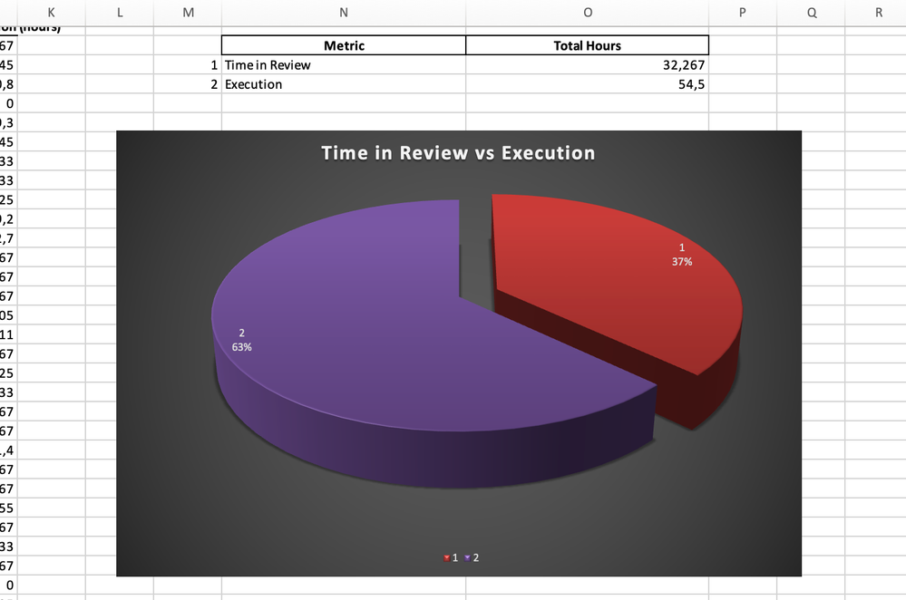
Time in Review vs. Execution
For development teams, a pie chart can show:
- The time spent on reviews (e.g., "Code Review," "QA Testing") versus execution (e.g., "Development").
- Imbalances in these phases, which might indicate overly lengthy reviews or inefficient development practices.
Execution Time Statuses
These statuses represent the active work phases where tasks are being completed:
- In Progress: The task is actively being worked on by the assignee.
- Development: Coding, designing, or building the solution.
- Implementation: Deployment or integration of the work.
- Active Work: Any phase indicating a team member is making progress.
- Rework Required: Tasks being corrected or modified after feedback.
Review Time Statuses
These statuses represent periods where tasks are paused for validation, feedback, or approval:
- Code Review: Peer or manager review of completed code.
- QA Testing: Quality assurance testing to ensure task functionality.
- Approval Pending: Awaiting sign-off from stakeholders or managers.
- Validation: Task is being assessed for accuracy or compliance.
- Customer Review: Waiting for feedback or approval from clients or external stakeholders.
On-Hold Time vs. Workflow Time
Some tasks may spend significant time in statuses like "On Hold" or "Waiting for Client Response." A pie chart can illustrate how much of the total workflow is consumed by such delays, giving teams insights into where processes can be streamlined.
On-Hold Time Statuses
These statuses indicate that a task is temporarily paused and no active work is being done:
- On Hold: Explicitly marked as paused due to resource or priority constraints.
- Waiting for Approval: Pending sign-off from a manager, client, or stakeholder.
- Waiting for Customer: Stalled while awaiting input or feedback from a customer.
- Blocked: Delayed due to unresolved dependencies or obstacles.
- Deferred: The task has been deprioritized but remains open for future action.
- Pending Dependencies: Waiting on another task or external deliverable to proceed.
Workflow Time Statuses
These statuses represent active progress in the workflow, where tasks are being worked on or moved forward:
- To Do: Tasks that have been identified and queued for execution.
- In Progress: Active work is being done by the team.
- Code Review: Peer or lead reviews are actively being conducted.
- Testing: Validation and quality checks are underway.
- Completed/Done: The task has reached its final status (as part of the workflow).

How to Export Time Metrics Data to Excel
Although the feature is not built into the add-on, creating a pie chart is simple with these steps:
1. Export the Data:
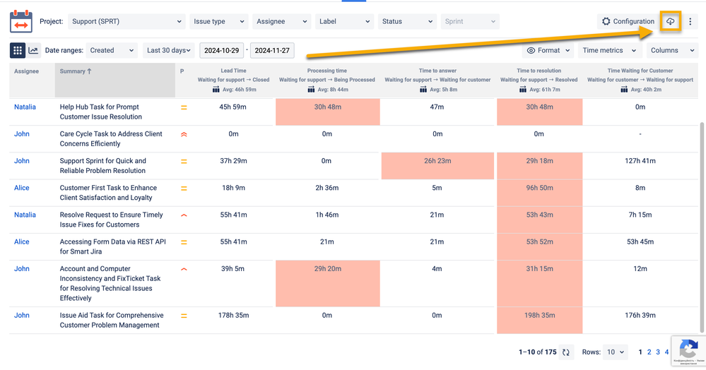
- Open your Time Metrics | Time Between Statuses add-on.
- Click the export button and select XLS or CSV.
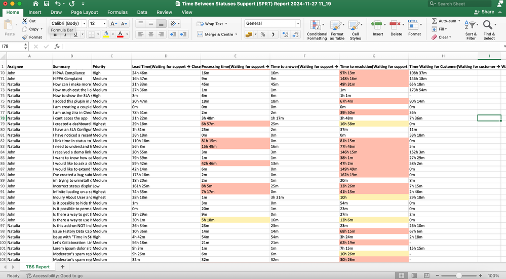
2. Get Time Data in Excel:
- Download Time Data Metrics into Excel and review the columns (e.g., statuses, time spent, and percentages).
- Aggregate or clean data if necessary (e.g., grouping smaller statuses into "Other")
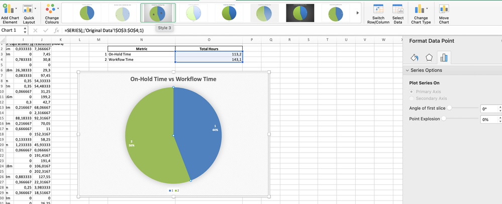
3. Create a Pie Chart in Exel:
- Calculate the relevant columns (e.g., Status and Percentage).
- Navigate to the Insert tab, then select Pie Chart.
- Customize your chart by adding titles, labels, and adjusting colors.
Conclusion
Pie charts remain one of the simplest and most effective tools for visualizing data, particularly when analyzing proportions across categories. Their ability to quickly communicate the distribution of time metrics, such as Productive vs. Blocked Time or Active vs. Idle Time, makes them indispensable for optimize your team workflow and identify bottlenecks.
With tools like the Time Metrics Tracker and Excel at your disposal, you have everything you need to turn raw data into compelling visuals that guide better workflow management.
Was this helpful?
Thanks!
Vitalii_Bobak_SaaSJet
About this author
Manager of Customer Success – SaaSJet
5 accepted answers




2 comments