Community resources
Community resources
Visualizing Time Metrics: How to Use Histograms Effectively
Histograms are a powerful tool for making sense of your data, especially when working with time metrics. They can help you identify patterns, pinpoint bottlenecks, and make informed decisions to keep your projects running smoothly. In this guide, we’ll walk you through everything you need to know about the Histogram, including how it works and practical tips to get the most value out of it. We will use the Time Metrics Tracker’s Histogram as a example. Let’s get started! 🚀📊
What is a Histogram? 📊
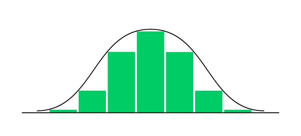
A histogram is a type of bar chart that visualizes the distribution of data by grouping it into intervals, called bins. Each bin represents a range of values, and the height of the bar reflects the frequency of data points within that range.
Why Histogram is it useful?💡
Histograms make it easy to identify trends, outliers, and patterns in data, allowing teams to pinpoint bottlenecks or inefficiencies in processes.
When Should You Use a Histogram? 📅
Histograms are ideal when you need to:
- Visualize data distribution to see how tasks are spread across time intervals.
- Identify common processing times to evaluate efficiency.
- Detect bottlenecks in workflows where issues accumulate.
- Spot anomalies that deviate from the norm, which might indicate process improvements or unique challenges.
Key Components of the Histogram Chart 🎯
- Issue Distribution: Displays the number of issues grouped by time intervals.
- Average Line: Highlights the average time for issues based on the selected metric.
- Default Bins: The histogram defaults to 7 bins, representing distinct time intervals. You can customize this further.
Use Case: Visualizing Issue Age Distribution by Histogram 📊
Issue Age Distribution refers to the time span between the first transition into the workflow's initial status (e.g., "To Do") and the last transition into the workflow's final status (e.g., "Done," "Resolved," or "Completed"). It provides insights into how long tasks take to progress from start to completion.
Visualizing this distribution on a histogram allows you to:
- Identify delays in resolution.
- Spot patterns or trends in issue handling.
- Highlight tasks that require immediate attention.
Configuring the Histogram for Issue Age Distribution
To set up this analysis:
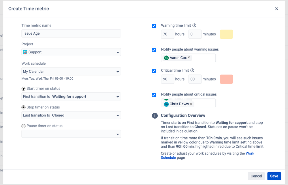
1. Create a Status Group:
Go to Create Time Metic

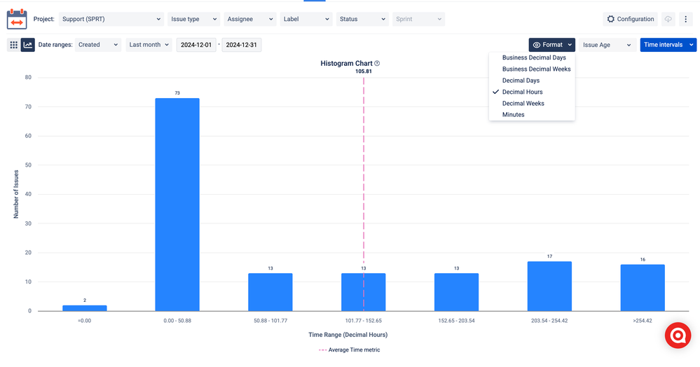
2. Histogram Time Intervals:
Switch to Histogram view
Use the histogram's customization options to adjust bin widths and time intervals to reflect meaningful groupings (e.g., weekly or monthly).

Interpreting the Histogram
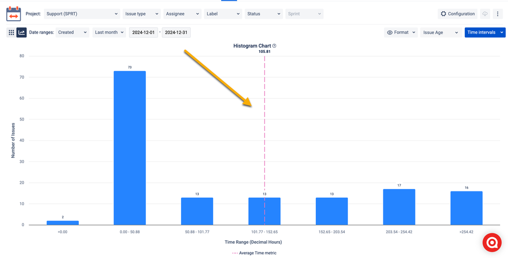
The histogram chart illustrates the distribution of issues based on their age (measured in decimal hours) across specific time intervals.
Here's an interpretation:
- X-Axis (Time Range): Represents the time intervals (in decimal hours) for issue age. Each bin groups issues within a particular range.
- Y-Axis (Number of Issues): Displays the count of issues in each time range.
Key Observations:
- Peak at 0.00–50.88 hours (Bin 2): The majority of issues (73) fall into this range, indicating that many issues are resolved relatively quickly or fall within a short duration after being created.
- Smaller Clusters in 50.88–203.54 hours: The bins in this range (13 issues each) show a consistent but smaller number of issues taking moderate time to resolve.
- Notable Grouping in 203.54–254.42 hours: A slight increase to 17 issues in this range might indicate delays or a backlog for a subset of tasks.
- Tail in >254.42 hours: 16 issues remain unresolved or take significantly longer to complete, representing the long-tail effect of extended resolution times.
Insights:
- The chart indicates efficient handling of a majority of issues, but the presence of issues in the longer time intervals suggests potential bottlenecks or unresolved dependencies.
- The average time metric (pink dashed line) provides a benchmark for evaluating how issues align with typical resolution durations.
Recommendations:
- Focus on Outliers: Investigate issues in the >203.54-hour bins to understand the causes of delays and mitigate recurring patterns.
- Improve Workflow Efficiency: Evaluate the processes or stages in your workflow contributing to extended issue age.
- Establish SLAs: Consider setting time-bound targets for resolution to reduce the tail in longer bins.
- Monitor Trends: Regularly analyze the histogram to track changes in issue resolution performance over time.
Best Practices for Using the Time Metrics Histogram 📈
- Analyze Distribution:
- Check bins for peaks (frequent times) or valleys (exceptions).
- Peaks might indicate consistent workflows, while valleys may point to anomalies.
- Focus on the Average Line:
- Use it as a benchmark to assess deviations in issue resolution times.
- Compare Multiple Metrics:
- Switch between time metrics to see differences across teams or workflows.
- Spot Trends:
- Look for bins with high counts to understand processing times better.
- Investigate outliers that fall outside expected ranges.
Fun Fact 💡
Histograms date back to William Playfair, a Scottish engineer and economist who revolutionized data visualization in the 18th century. Since then, they’ve become indispensable in data analysis!
Ready to Visualize Your Data? 🌟
Histograms are more than just charts—they're a gateway to uncovering insights, spotting inefficiencies, and improving workflows. So, why wait? Start using histograms today and empower your team to make decisions with confidence. Your projects deserve the clarity that only a great visualization can provide! 🚀📊
Was this helpful?
Thanks!
Vitalii_Bobak_SaaSJet
About this author
Manager of Customer Success – SaaSJet
5 accepted answers


0 comments