Community resources
Community resources
Community resources
I want to know if anyone has ever tried to build customized dashboard that would like that
Hello Dear community
I want to know if anyone has ever tried to build customized dashboard that would like that ? where each color can define something like for example completed issues in green , blocked in blue and done in orange for example ?
Thank you

2 answers
2 accepted
Yes, if those colors represent workflow issue statuses or board columns, then you can easily display such chart on your dashboard by using the Cumulative Flow Diagram (CFD) gadget offered by our Great Gadgets app. The app is free for up to 10 users.
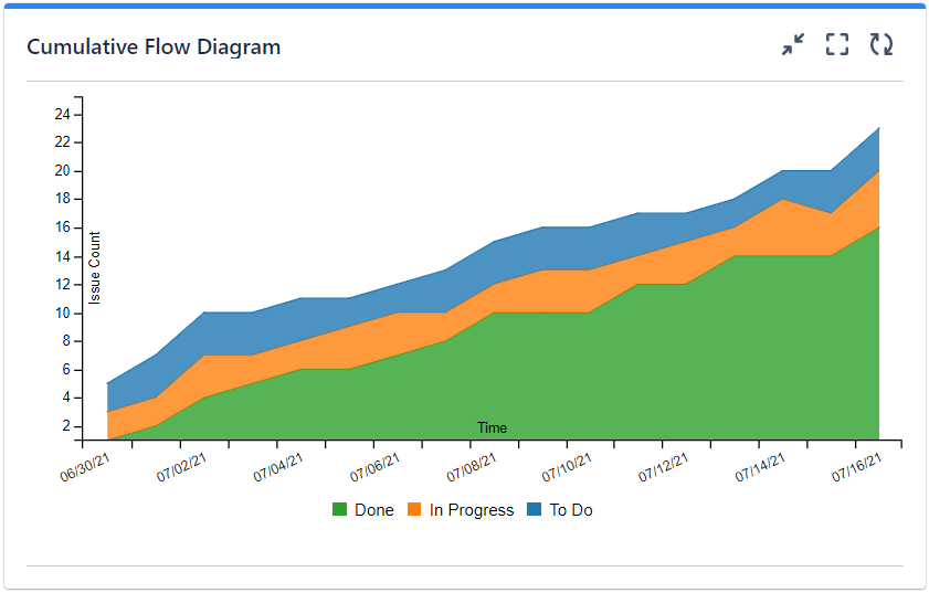
The gadget is highly configurable and offers many other options.
This app offers many other gadgets that you can use to track your projects in an efficient and effective way. Just have a look over the articles from our blog to make an idea.
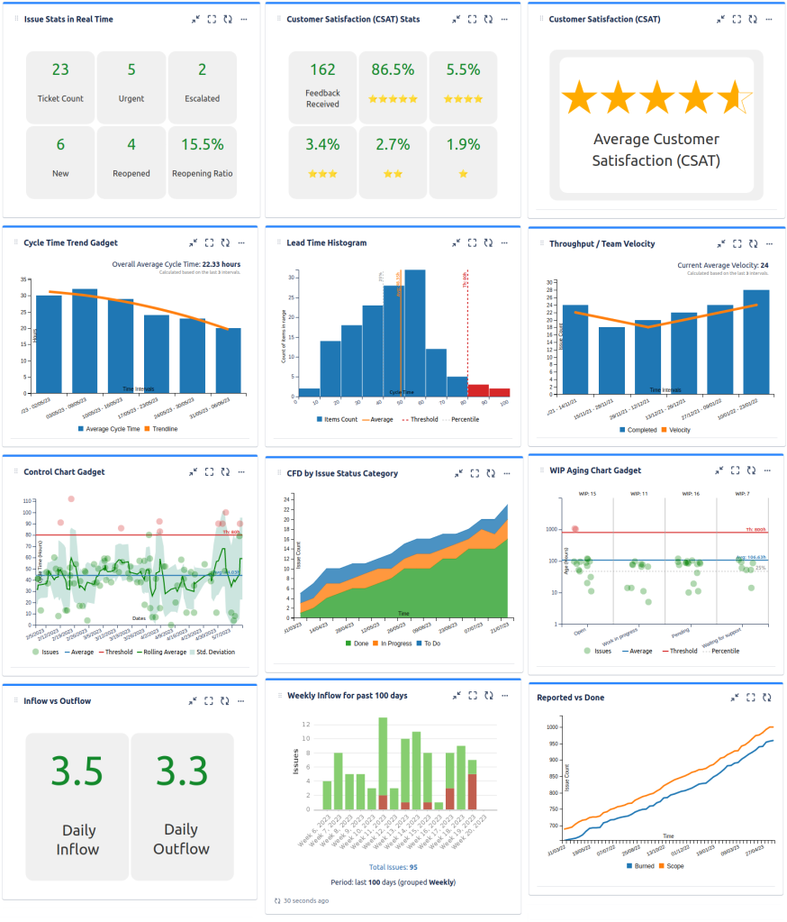
It can be a great asset for your team or company.
I hope this helps.
Thank you,
Danut Manda
This use case, if I interpret correctly, sounds very typical. You want to create a stacked bar chart with the time on the X axis, where you calculate the bar segments based on the number of issues in a given status. And you probably want to choose a saved filter or JQL as input.
I am quite sure that EazyBI can do this for you.
You must be a registered user to add a comment. If you've already registered, sign in. Otherwise, register and sign in.

You must be a registered user to add a comment. If you've already registered, sign in. Otherwise, register and sign in.