Community resources
Community resources
- Community
- Products
- Jira Service Management
- Questions
- Unresolved vs Resolved issues by date?
Unresolved vs Resolved issues by date?
I'd like to display a chart that shows the amount of unresolved vs resolved issues per quarter in a dashboard. Essentially what I'm trying to show is a grouped line chart that shows unresolved vs resolved.
For example:
X-Axis = Date (Q1, Q2, Q3, Q4)
Y-Axis = Issue Count
Two lines being displayed one being unresolved issues and the other being resolved.
Thanks!
2 answers
Hi @Jared McNeil,
Take a look also on this article on our blog: An effective dashboard for Service Desk and Customer Support teams in Jira Service Management.
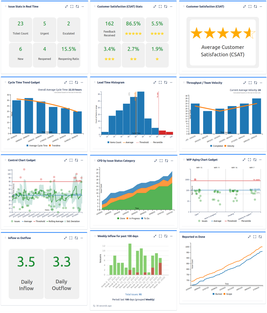
I think that you could use the Advanced Issue Filter Formula Gadget to display the counts for each quarter. There is also a Reported vs Done Chart example chart and well as CFD chart, that might be useful.
Regards,
Danut M.
Hi @Jared McNeil - Is there a reason you can't just use the native Created vs Resolved chart and configure the period for Quarterly?
You must be a registered user to add a comment. If you've already registered, sign in. Otherwise, register and sign in.
Hi @Mark Segall,
I don't necessarily need to know what's been created, more so what is not in the resolved status. The "created" would also be including the resolved resolution correct?
You must be a registered user to add a comment. If you've already registered, sign in. Otherwise, register and sign in.
The gadget allows you to see created vs resolved and there's an option to "Display trend of unresolved".
You must be a registered user to add a comment. If you've already registered, sign in. Otherwise, register and sign in.

You must be a registered user to add a comment. If you've already registered, sign in. Otherwise, register and sign in.